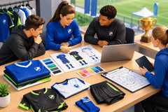
Team Apparel Color Trends for Stronger Team Identity
A uniform can look premium before the first whistle, or look dated before warmups even begin. The difference is often color. The strongest team apparel color trends for 2026 are not about chasing one flashy shade. They are about building a clear identity that looks powerful on the field, photographs well, and stays recognizable from the sidelines.
For coaches, club organizers, and school programs, color decisions also affect the practical side of an order. Dark colors can hide turf stains. High-contrast numbers improve visibility. A smart accent color can make a custom soccer jersey, volleyball uniform, or basketball kit feel fully branded without raising the complexity of the design.
Team Apparel Color Trends That Teams Can Use Now
Deep navy, black, and charcoal remain the winning base colors
Black is not going anywhere, but teams are using it with more intention. Instead of an all-black jersey with hard-to-read graphics, the current look pairs black with bright contrast: electric blue, neon green, red, gold, white, or even a bold purple. It feels sharp, competitive, and easy to coordinate across jerseys, shorts, warmups, and hoodies.
Deep navy is another strong choice, especially for schools and clubs that want a classic look with a little more depth than standard royal blue. Navy works with white, light blue, silver, gold, and bright orange. It also holds up well for travel gear and coaching polos, where a loud uniform color may not make as much sense.
Charcoal is gaining ground as a modern neutral. It gives teams a clean, athletic foundation while making bright logos and player numbers stand out. The trade-off is that charcoal can look flat if every detail is dark. Add a clear secondary color, a visible number treatment, or a patterned sublimation panel to keep it from blending into the background.
Bright accent colors are doing the heavy lifting
The most effective modern uniforms often use one dark or neutral base with one energetic accent. Think black with volt green, navy with aqua, maroon with gold, or charcoal with bright red. That accent can appear in shoulder panels, side stripes, collar trim, sleeve details, names, numbers, and logo outlines.
This approach gives teams more flexibility than a full neon uniform. A bright accent delivers energy without overwhelming the design. It also makes it easier to create matching tracksuits, polos, hoodies, and supporter apparel that feel connected to the game-day kit.
For soccer teams, a bright sleeve or side-panel detail can create motion without affecting number visibility. For basketball uniforms, contrasting neck and arm trim can pull the whole design together. For volleyball, where teams move quickly and spend a lot of time indoors, vibrant accents can be especially effective under gym lighting.
Retro color combinations are back with a cleaner finish
Retro sports style is showing up in custom teamwear, but not as a copy of old uniforms. Teams are using classic combinations such as red and cream, forest green and gold, royal blue and white, or burgundy and gray with cleaner fonts, sharper graphics, and modern sublimated patterns.
A vintage-inspired palette works particularly well for established clubs, school programs, alumni teams, and community leagues. It gives the uniform history without making it look old-fashioned. A cream or off-white detail can feel more premium than bright white, while muted gold can create a traditional championship look.
The key is restraint. If the color palette already has a retro feel, avoid adding too many graphic effects. A subtle stripe, tonal pattern, or vintage badge-style logo is usually enough.
High Contrast Still Matters More Than Fashion
A jersey has a job to do. Players need to be identified quickly by teammates, referees, scorekeepers, photographers, and spectators. That means number and name contrast should always come before a trend.
Light numbers on a dark jersey are usually the safest choice. White, bright yellow, light blue, and silver can work well depending on the base color. Dark numbers on a pale jersey can also look clean, but organizers should consider how that color performs under stadium lights, in a school gym, or on video.
Avoid placing a number over a busy graphic, even when the graphic looks great in a mockup. Sublimation gives teams incredible design freedom, but the best custom uniforms use that freedom strategically. Keep the number zone cleaner, or add a solid backing shape so every digit stays easy to read.
This is especially important for goalie kits. Goalkeepers often wear bold colors to stand apart from both teams, but the design still needs a highly visible number. Neon yellow, orange, green, and bright aqua remain popular goalie choices because they are easy to spot. Just make sure the number color does not disappear against the main jersey color.
Tonal Designs Give Teams a Premium Look
Tonal uniforms use different shades of the same color family: navy with sky blue, red with burgundy, or black with dark gray. The result is subtle, polished, and often more expensive-looking than a design with too many competing colors.
This trend works well with sublimation because patterns can be built into the fabric without adding weight or changing the feel of the jersey. Tonal camo, geometric lines, topographic textures, faded stripes, and abstract waves can add depth while keeping the overall uniform clean.
The downside is visibility. A tonal design needs a contrasting logo, number, or accent detail to avoid looking too quiet from a distance. If your team wants a strong sideline presence, pair that tonal base with crisp white numbers, a bright logo outline, or a standout collar color.
Gradient color effects need a clear purpose
Gradients are still popular, especially in soccer and esports-inspired teamwear. A fade from dark blue to light blue, black to red, or purple to pink can create a bold, custom look. But gradients are most effective when they support the team identity rather than becoming the entire identity.
A good gradient should have enough contrast to show clearly from a distance. It should also leave room for the logo, player name, and number. If every area of the jersey is changing color, key details can get lost.
For youth teams, gradients can be a great way to create excitement and give players something they are proud to wear. For schools and competitive clubs, a more controlled gradient with a consistent primary color may offer better long-term branding.
Build a Color System, Not Just a Jersey
The best uniform programs do not stop at one kit. They build a repeatable color system that works across home uniforms, away uniforms, goalie jerseys, training shirts, travel tracksuits, coach polos, and fan hoodies.
Start with a primary color that represents the team. Add a secondary color for contrast, then choose one accent color if needed. This gives you enough variety for custom apparel without turning every item into a different design.
For example, a club may use navy as its primary color, white as its secondary color, and bright teal as its accent. The home soccer uniform can be navy with teal details. The away kit can be white with navy and teal details. Coaches can wear navy polos. Players can wear charcoal hoodies with a teal logo. Everything looks connected, even when each item serves a different purpose.
This approach also makes reorders easier. New players, replacement jerseys, and future seasons can follow the same color standards. That protects your team identity and helps prevent mismatched apparel over time.
Choose Colors for Your Sport and Setting
The right palette depends on where and how your team competes. Outdoor soccer teams often benefit from strong colors that hold up against green turf, bright sun, and muddy fields. Indoor volleyball teams can use brighter shades because gym lighting and court surfaces create a different visual environment. Basketball programs may prefer classic school colors with clear trim and bold numbers.
Age matters too. Youth teams can often go brighter and more playful. Adult leagues may prefer a cleaner black, navy, charcoal, or retro-inspired look. Neither choice is better. The best color direction is the one players will wear confidently and organizers can use consistently across the program.
Before placing a full order, ask to see the design as a complete uniform, not only as a jersey front. Look at the front, back, shorts, logo placement, number color, and any matching teamwear. A free mockup helps catch weak contrast, overly busy panels, and color combinations that looked better in theory than on the actual kit.
RRR Sports America can help teams turn a color idea into a custom, sublimated design that fits the sport, the budget, and the deadline. Whether you want classic school colors, a bold modern palette, or a clean retro uniform, the goal is the same: make every player look like part of one team.
Choose colors your players can recognize instantly, opponents can spot from across the field, and your program can proudly carry into the next season.